Why Earthy Tones Will Dominate Interior Design in 2026
8 September 2026
Walk into any high-end showroom today and you will notice something shifting. The stark whites, the cold greys, and the glossy blacks that defined the last decade are stepping aside. In their place, you find warm ochres, deep terracottas, soft clay pinks, and rich olive greens. This is not a fleeting trend or a seasonal palette rotation. It is a fundamental response to how we live, how we work, and how we feel inside our homes. By 2026, earthy tones will not just be popular. They will be the default language of residential interior design.
The move toward earthy tones is not about copying a style from the 1970s or simply applying a coat of beige paint. It is about a deeper psychological and practical shift. After years of digital saturation, screen fatigue, and a global push toward sustainability, people are craving spaces that feel grounded, tactile, and honest. Earthy tones deliver that because they are derived from materials we instinctively trust: soil, stone, clay, bark, and leaves. This article explains why this movement is accelerating, how to use these colors correctly, and where many homeowners and even designers go wrong.
The Psychological Pull Toward Grounding
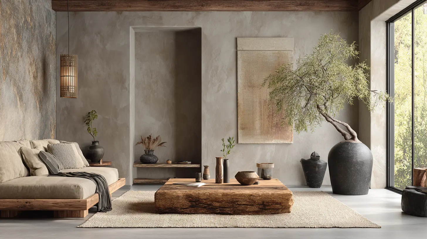
Let us start with the most powerful driver: human psychology. The past five years have been defined by uncertainty. Economic instability, climate anxiety, and the lingering effects of a global health crisis have left many people feeling unmoored. Our homes became our offices, our schools, and our sanctuaries. But for a long time, those homes were decorated for a world that no longer existed. The open-plan white box with a grey sofa was designed to look clean and efficient, not to comfort.Earthy tones work because they tap into biophilia, our innate connection to nature. When you surround yourself with colors that mimic the natural world, your nervous system responds. It is not mystical. It is physiological. Studies on color psychology have repeatedly shown that warm, low-saturation tones reduce cortisol levels and promote a sense of safety. A deep russet brown wall does not shout for attention. It wraps the room like a blanket. A sage green kitchen cabinet does not reflect harsh light. It absorbs it and softens the entire space.
By 2026, this need for grounding will be even more pronounced. As artificial intelligence becomes more integrated into daily life, the line between digital and physical blurs further. The home will become the last authentic refuge. People will want materials and colors that prove they are real, that have texture, and that age gracefully. You cannot fake the warmth of a limewash plaster wall with a digital rendering. You have to feel it with your hand. Earthy tones are the visual equivalent of that tactile authenticity.
The Failure of the Grey Era
To understand where we are going, we must acknowledge what we are leaving behind. The grey era, which peaked around 2015 to 2022, was a response to minimalist aesthetics and the rise of the "influencer" interior. Everything was greige, cool grey, or charcoal. It looked sophisticated in photographs, especially with bright white trim and brass fixtures. But there was a fatal flaw.Grey is a color of detachment. It does not absorb light warmly; it reflects it in a flat, sterile way. In real life, under natural daylight, an all-grey room can feel cold and unwelcoming, especially in northern climates or in apartments with limited sun. Homeowners complained that their spaces felt like hotel lobbies or worse, like waiting rooms. The style was aspirational but not livable.
The shift to earthy tones is not a rejection of minimalism itself. It is a rejection of minimalism that lacks warmth. You can still have a minimalist room in 2026, but it will be built on a foundation of warm limestone, travertine, and oak, not on cool grey plaster and chrome. The new minimalism is about editing, not about erasing warmth.
Materiality Drives the Color Palette
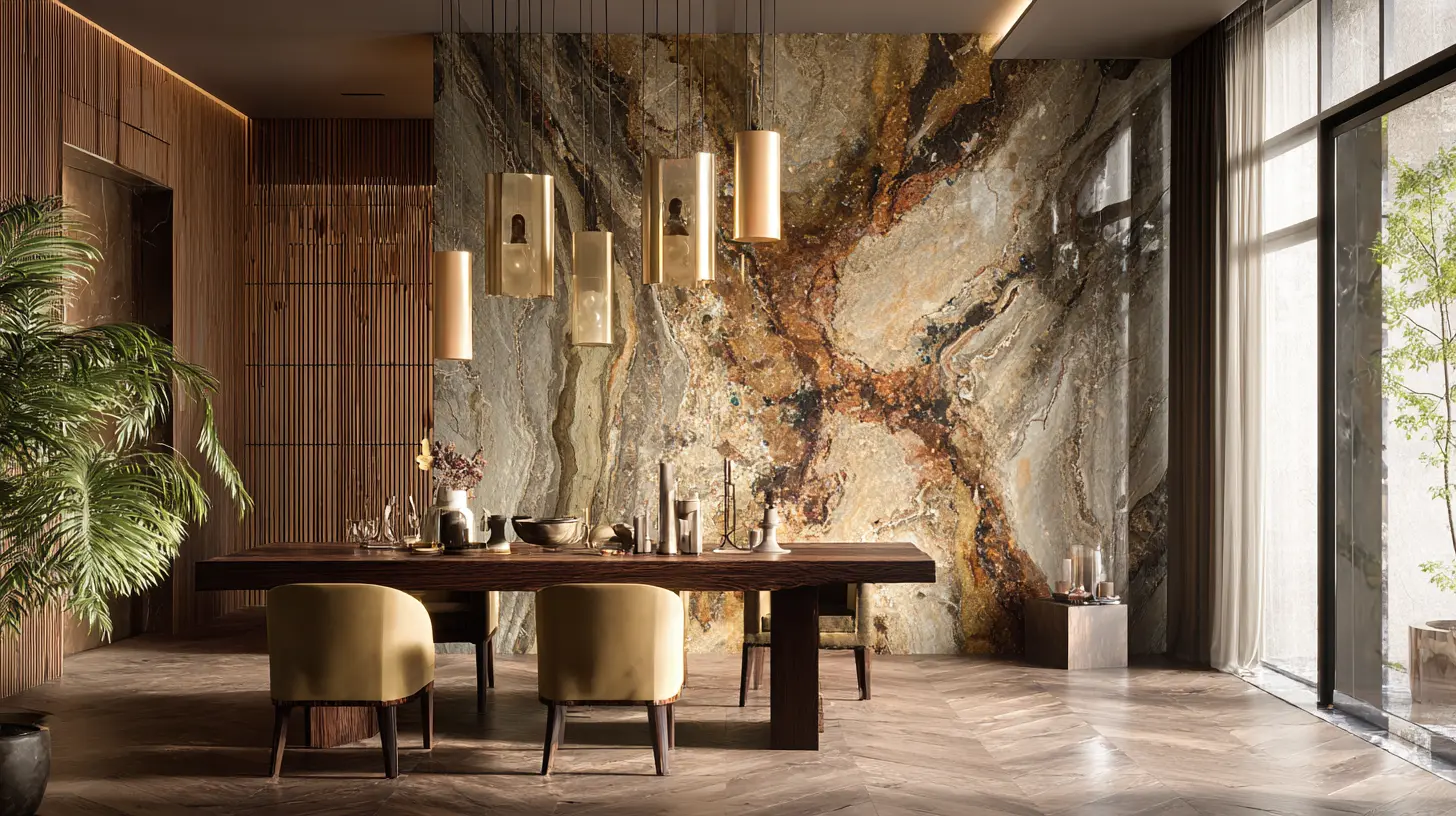
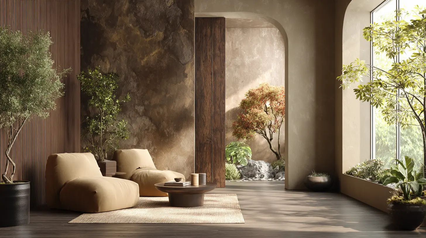
Here is a crucial point that many trend articles miss: earthy tones in 2026 will not just be paint colors. They will be the natural result of the materials we choose. You do not paint a countertop to look like sandstone. You use sandstone. You do not stain a floor to mimic walnut. You use white oak or black walnut.This material-first approach is what separates the genuine movement from a superficial trend. When you walk into a room designed with this philosophy, you see color as a byproduct of substance. The terracotta tile is not just a color choice. It is a functional, durable surface that retains heat and develops a beautiful patina over time. The olive green sofa is not just a trendy hue. It is upholstered in a heavy linen weave that feels cool in summer and cozy in winter.
This reliance on natural materials also aligns with the sustainability movement. In 2026, consumers will be far more educated about the lifecycle of their purchases. A synthetic fabric dyed in a chemical process to mimic an earthy tone is not the same as a natural fiber dyed with plant-based pigments. The former is greenwashing. The latter is genuine. Designers who understand this will steer clients toward clay plasters, lime washes, natural cork, wool, and unglazed ceramics. These materials have inherent color variations, which adds depth and character that flat synthetic paints cannot replicate.
Specific Earthy Tones to Watch in 2026
Let us get specific. While the overarching category is "earthy tones," the next year will see a clear hierarchy of shades that work particularly well in residential spaces.Terracotta and Burnt Sienna
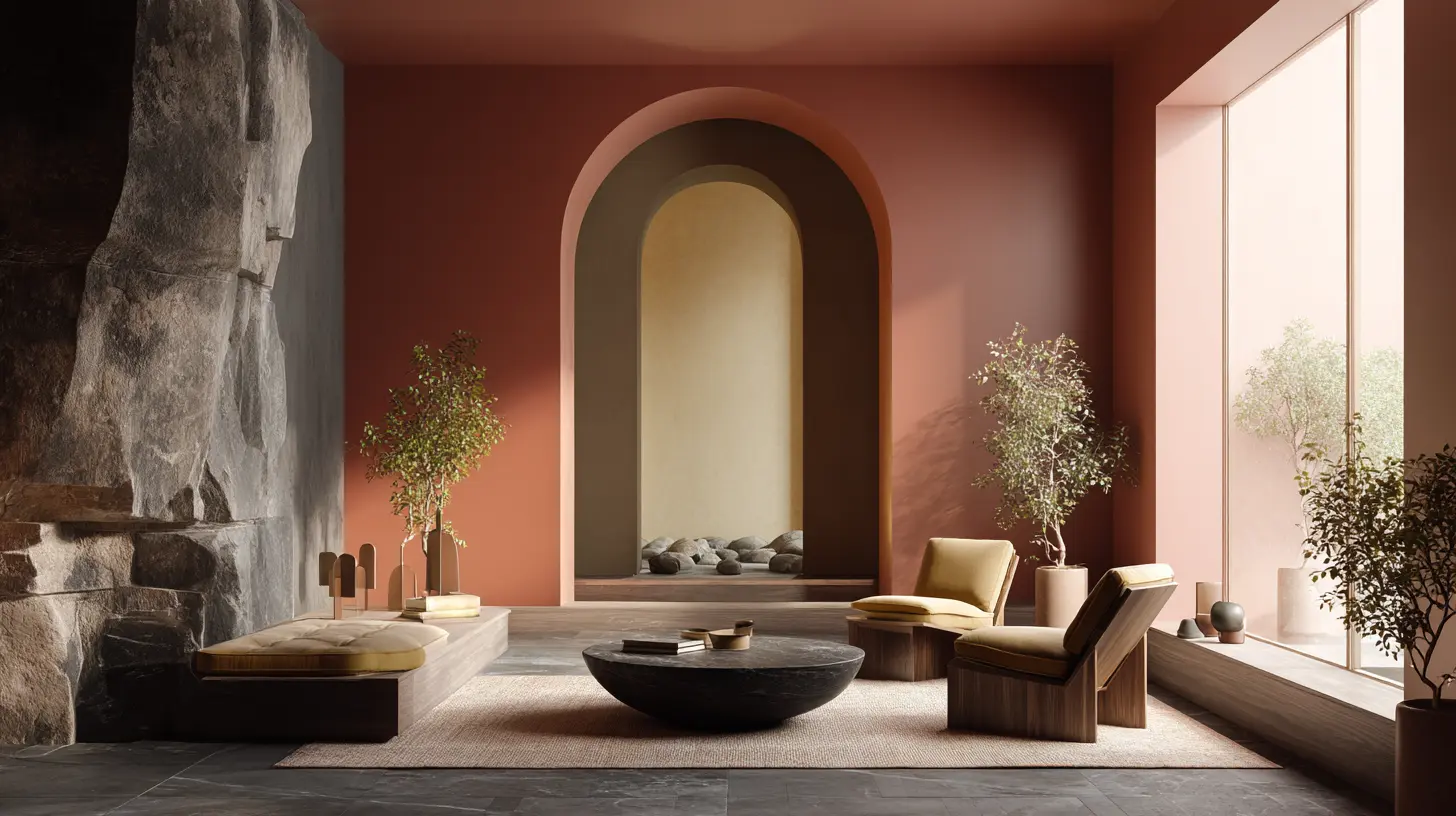
Terracotta is the undisputed champion of the movement. It exists on the border between orange and brown, with a mineral quality that feels ancient. In 2026, expect to see terracotta used not just in small accents like vases or planters, but on entire feature walls and in tile form for backsplashes and bathroom floors.The key to using terracotta successfully is to balance its intensity. A full room painted in dark burnt sienna can feel oppressive. Instead, use it in a room with abundant natural light, or pair it with lighter elements such as undyed linen curtains, whitewashed oak beams, or a pale cream ceiling. Terracotta works beautifully in entryways and dining rooms, where you want a sense of warmth and welcome without the need for constant calm.
Olive and Sage Greens
Greens are the most versatile earthy tones. They bridge the gap between warm and cool, making them easier to live with over long periods. Olive green has a yellow undertone that harmonizes with wood and brass. Sage green has a grey undertone that works well in smaller, darker spaces because it does not close them in.In 2026, the trend will move away from the bright, minty greens of the past and toward deeper, more muted tones. Think of the color of eucalyptus leaves or the inside of a walnut husk. These greens are perfect for cabinetry, built-in bookshelves, and even ceilings. A deep olive ceiling in a study or library creates a cocooning effect that is difficult to achieve with any other color.
Warm Umber and Cocoa Browns
Brown is making a serious comeback, but it is not the yellow-brown of 1990s oak cabinets. It is the rich, almost black-brown of dark chocolate, and the lighter, creamy brown of cappuccino. These shades are being used on walls, which was previously considered a risky move.The secret to a successful brown wall is sheen. A matte or flat finish on a brown wall absorbs light and creates a velvety texture. Glossy brown can look cheap or dated. Use warm browns in bedrooms and media rooms where you want to lower the ambient light and create intimacy. They also serve as an excellent backdrop for art, as the dark wall makes bright colors pop.
Sandy Beige and Greige Alternatives
Beige has been mocked for years, but the beige of 2026 is not the boring, flat builder-beige of the 2000s. It is a warm, slightly pink or peach-tinted sand color. It is often called "greige" but with a much warmer undertone than the cool greige that dominated the 2010s.This new beige is best used as a base color for walls in open-plan living areas. It is forgiving, does not show dust as much as grey, and pairs seamlessly with natural wood floors. It is the perfect neutral because it is not sterile. It has a life to it that changes throughout the day as the light shifts.
How to Pair Earthy Tones Without Making Mistakes
The most common mistake homeowners make when adopting earthy tones is going monochromatic to the point of boredom. They paint every wall the same shade of sand, buy a beige sofa, and put down a beige rug. The result is a room that looks like a bowl of oatmeal. It is warm, but it is lifeless.The solution is contrast. Earthy tones need each other to create depth. You should not have just one earthy color in a room. You need at least three, ideally from different families. For example, a room with olive green walls needs a warm terracotta accent chair and a light sand-colored rug. The green provides the main visual weight, the terracotta adds a pop of heat, and the sand grounds the space and prevents it from feeling too dark.
Another mistake is ignoring the undertones of wood. Many people choose earthy paint colors and then pair them with cool-toned grey wood floors or furniture with a blue undertone. This creates a jarring clash. Before you pick a paint color, bring a sample of your flooring and your largest piece of wood furniture to the paint store. Hold the paint chip next to the wood. If the wood has a red undertone, choose paint with a yellow or orange undertone. If the wood is very pale and almost white, you can get away with cooler earthy tones like sage.
Lighting is the other critical factor. Earthy tones are highly reactive to light. In a north-facing room with cool, grey daylight, a warm terracotta can look flat and brown. In a south-facing room with golden afternoon sun, the same terracotta will glow with intensity. Always test paint colors on multiple walls and observe them at different times of day. Do not rely on the tiny swatch from the store. Buy a sample pot, paint a large piece of foam board, and move it around the room for a few days.
The Trade-Offs Between Earthy Tones and Other Styles
It would be dishonest to claim that earthy tones are the right choice for every situation. There are trade-offs. For example, a high-contrast black-and-white interior can feel more dramatic and graphic. It is easier to keep looking sharp because the color scheme is so simple. Earthy tones require more careful curation. You cannot just buy a black sofa and white walls and call it done. You need to think about textures, material finishes, and the interplay of multiple warm neutrals.Earthy tones also absorb light. If you have a very small, windowless room, a dark olive or brown will make it feel like a cave. In such spaces, you should use earthy tones only as accents, not as the main wall color. A better approach for a dark hallway is to use a warm white or pale sand on the walls and bring in earthy tones through the floor, the door frames, and decorative objects.
There is also a financial trade-off. As mentioned earlier, the authentic version of this trend relies on natural materials. Real clay plaster is significantly more expensive than standard drywall with paint. Travertine and limestone tile cost more than porcelain. If you are on a tight budget, you can still achieve the look with paint and good quality textiles, but you must be honest with yourself about the difference. A polyester rug that looks like wool will not age the same way. It might fade or flatten in a year. A real wool rug will last decades. If you are designing for the long term, budget for the real materials.
Common Misconceptions About Earthy Tones
One major misconception is that earthy tones are only suitable for rustic, farmhouse, or traditional interiors. This is completely false. Earthy tones can be used in ultra-modern, minimalist spaces with great success. The key is in the application. A modern living room with clean lines, a floating concrete bench, and a single wall finished in smooth, polished lime plaster in a warm sand color looks incredibly contemporary. The earthy tone adds warmth without adding clutter or ornament.Another misconception is that earthy tones are all dark and heavy. In reality, the palette includes many light, airy shades. Pale clays, soft chalky whites with a hint of yellow or pink, and light greige are all part of the earthy family. These light tones can make a room feel larger and brighter, just like white can, but they do so with more depth. They do not feel as sterile or as cold as pure white.
Some people also believe that earthy tones are difficult to match with art and accessories. This stems from a fear of color clashing. The opposite is true. Earthy tones are incredibly forgiving. A warm beige wall can handle a wide range of art, from bold modern abstract pieces to classical landscapes. Because the wall color is muted, it recedes into the background and lets the art take center stage. The same cannot always be said for a stark white wall, which can make a colorful painting feel disconnected from the room.
The Role of Technology and Smart Homes
As we move toward 2026, technology will play a supporting role in this design shift. Smart lighting systems now allow homeowners to adjust the color temperature of their lights throughout the day. This is crucial for earthy tones. In the morning, you want a brighter, slightly cooler light to wake you up. In the evening, you want a warm, dim, amber-like glow that enhances the brown and terracotta pigments in your walls.The mistake many people make is installing standard 5000K daylight bulbs, which are very blue and white. These bulbs wash out earthy tones, making them look grey and muddy. By 2026, expect to see more widespread adoption of tunable white lighting systems that can shift from 2700K in the evening to 4000K in the morning. If you are building or renovating, plan for this now. It is much easier to install the wiring for smart lighting during construction than to retrofit it later.
the rise of large-format digital displays and virtual reality tools in home design will help people visualize earthy tones before committing. This reduces the risk of a costly mistake. You can take a photo of your room, upload it to a design tool, and virtually paint the walls in different earthy shades. This is not a substitute for testing real paint samples, but it is an excellent first filter.
Practical Steps for Homeowners in 2025
If you are convinced that earthy tones are right for your home, here is a practical roadmap to follow.First, start small. Do not repaint your entire house in a weekend. Choose one room that you use daily, such as the primary bedroom or the living room. Paint one accent wall in a deep earthy tone like terracotta or olive. Live with it for a month. See how it feels in the morning, at noon, and at night. If you love it, expand to the other walls in that room.
Second, focus on the floor. The floor is the largest surface in any room and the most often ignored. If you have light grey vinyl flooring, no amount of earthy paint will make the room feel grounded. You need a warm wood floor, either real wood or a high-quality laminate that mimics natural oak or walnut. If you cannot replace the floor, use large area rugs in warm, natural fibers like jute or sisal to cover as much of the cold floor as possible.
Third, invest in texture. Earthy tones look best when paired with a variety of tactile surfaces. A room with a smooth clay wall needs a chunky knit throw, a rough linen sofa, and a smooth ceramic vase. This contrast of textures prevents the space from feeling flat. When you shop for accessories, close your eyes and touch the items. If everything feels the same, the room will be boring.
Fourth, be patient with the transition. If your home is currently decorated in cool greys and whites, you cannot change everything overnight. Start by swapping out your throw pillows and blankets for warm terracotta and olive pieces. Replace your silver or chrome picture frames with brass or wood. Change your white lampshades to beige or sand-colored ones. These small changes will slowly shift the atmosphere of the room before you commit to a full paint job.
The Future Beyond 2026
Will earthy tones last, or will they fade like the grey trend did? The evidence suggests they will have more staying power. The reason is that this trend is not driven by novelty but by values. Sustainability is not a fad. The desire for calm and connection to nature is not a fad. The rejection of sterile, screen-like environments is a long-term cultural shift.However, colors will evolve. By the late 2020s, we may see a push toward even more saturated, jewel-toned earth colors, such as deep burgundy and forest green. We may also see a blending of earthy tones with more industrial elements like blackened steel and concrete, creating a "warm industrial" look. The underlying principle, that our homes should feel like a natural extension of our bodies and our environment, will remain.
For designers, the advice is to study the materials rather than just the colors. Learn how lime plaster behaves in humid climates. Understand the maintenance of unsealed terracotta. Know which woods are sustainably harvested. This expertise is what will set you apart as a professional. For homeowners, the advice is to trust your gut but verify with samples. Do not buy a whole room based on an Instagram photo, because the lighting in that photo is not your lighting. Buy one piece, one paint pot, one rug. See how it makes you feel when you walk into the room after a long day at work. That feeling, not a trend report, is the true test.
The homes of 2026 will not be perfect showpieces. They will be lived-in, warm, and textured. They will smell like wood and clay, not like fresh paint and plastic. They will have corners that invite you to sit down and stay a while. And the colors will be the colors of the earth beneath our feet, reminding us that no matter how digital our lives become, we are still physical beings who need grounding. That is why earthy tones will dominate. Not because they are fashionable, but because they are fundamentally human.
all images in this post were generated using AI tools
Category:
Home DesignAuthor:

Basil Horne
Discussion
rate this article
2 comments
Holden Watson
Earthy tones resonate with nature, creating a calming atmosphere in homes. Their versatility allows for various styles, from rustic to modern. This trend reflects a deeper connection to our surroundings and personal well-being.
September 22, 2026 at 2:00 AM
Bellamy Klein
So, earthy tones are taking over? Great! Finally, I can justify my obsession with plants and brown couches. Who knew my living room would be trendy by simply being... well, me!
September 18, 2026 at 2:25 AM
Basil Horne
Absolutely! Your style is on point. Earthy tones bring that cozy vibe and celebrate nature, so it's perfect for plant lovers and brown couch enthusiasts alike. Keep rocking your look!