Elevating Curb Appeal with Modern Exterior Design Ideas
3 November 2026
Curb appeal is the handshake your house offers before anyone steps inside. It sets expectations, stirs emotion, and quietly shapes how a property is valued, whether by a neighbor walking a dog or a buyer scanning listings on a phone. Modern exterior design has changed what that handshake looks like. The fussy shutters and symmetrical shrubs of previous decades have given way to cleaner lines, warmer materials, and lighting that works after sunset. The good news is that none of this requires a celebrity architect or a six-figure budget. It requires judgment about what suits your house, your climate, and your street.
This guide walks through modern exterior ideas that genuinely move the needle, explains why they work, and flags the trade-offs so you can decide what belongs on your own facade.
What "Modern" Actually Means for a House Exterior
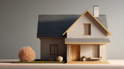
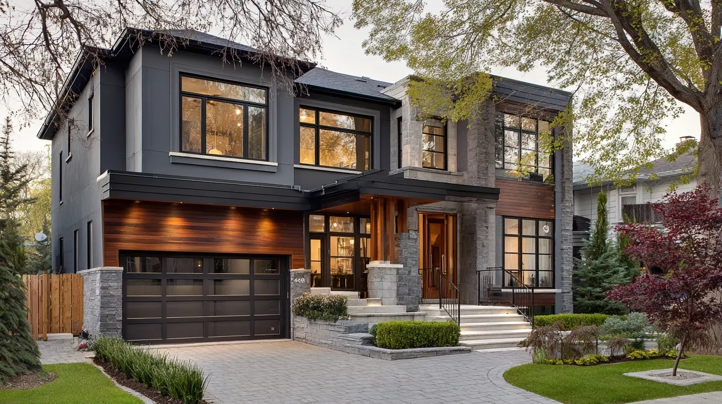
Modern exterior design is not a single look. It is a set of priorities: honest materials, restrained color, strong geometry, and a deliberate relationship between the building and the landscape. A modern facade tends to remove clutter rather than add ornament. It favors depth through layering, texture through material contrast, and function through thoughtful lighting and pathways.There is a common misconception that modern means cold. Done poorly, it can feel that way. A white box with black window frames and gravel can read as severe. Done well, modern design is warm because it balances crisp lines with natural materials, soft lighting, and greenery that softens hard edges. The goal is not minimalism for its own sake. The goal is clarity.
Another misconception: modern exterior design only suits new construction. In practice, many of the strongest results come from updating a traditional house with modern touches. A mid-century ranch, a colonial, and a bungalow can all absorb modern ideas if the changes respect the original proportions. The trick is to modernize the details without fighting the architecture.
Start With the Bones: Proportion, Rhythm, and Color
Before buying a single planter, look at your house the way a designer does. Stand across the street and squint. What shapes dominate? Where does the eye land? Is the entry obvious, or does it get lost?Proportion and rhythm matter more than any individual product. Modern design relies on repeated elements, such as evenly spaced windows, consistent trim depth, or a repeated material band, to create visual order. If your house has an awkward add-on or a mismatched garage, exterior color and material choices can either emphasize the problem or knit it together. A single continuous color across a lumpy facade often reads as one calm volume, while contrasting trim can highlight every inconsistency.
Color strategy deserves real thought. Modern palettes tend to be tonal: a base color with trim a shade lighter or darker rather than a stark contrast. Dark facades, from charcoal to deep bronze, have become popular because they make greenery pop and give a house a confident presence. The trade-off is heat absorption in sunny climates and the fact that dark siding shows dust and pollen. Light palettes reflect heat and feel airy, but they can look flat without texture or shadow. A safe, effective approach is to pick a base color, choose trim within two shades of it, and reserve your boldest color for the front door.
The Front Door as the Focal Point
The front door is the cheapest high-impact change on most houses. A modern door tends to be wider, often with a horizontal grain, a simple handle, and either a bold color or a natural wood finish. Widening a standard 36-inch door to 42 inches is a bigger project than most people expect because it involves framing and often a new header, but the payoff is a more generous, contemporary entry.Color choice on the door is where personality lives. A deep teal, a burnt orange, or a saturated olive can transform a neutral facade. The reason bold doors work is contrast and focus: they give the eye a destination and make the entry legible from the street. The risk is trend fatigue. A door is easy to repaint, though, so this is one of the few places where you can afford to be adventurous.
Hardware is the detail people notice without knowing they notice it. A long, simple pull in matte black or brushed brass reads modern. Oversized ornate handles and multiple deadbolts read dated. If security matters, and it should, choose a clean keypad or smart lock rather than bolting extra hardware onto a beautiful door.
Siding and Material Mixing Done Right
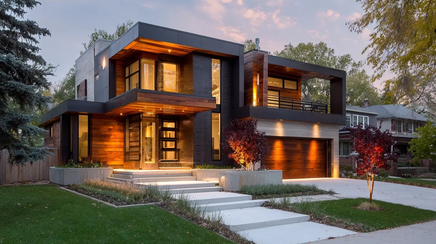
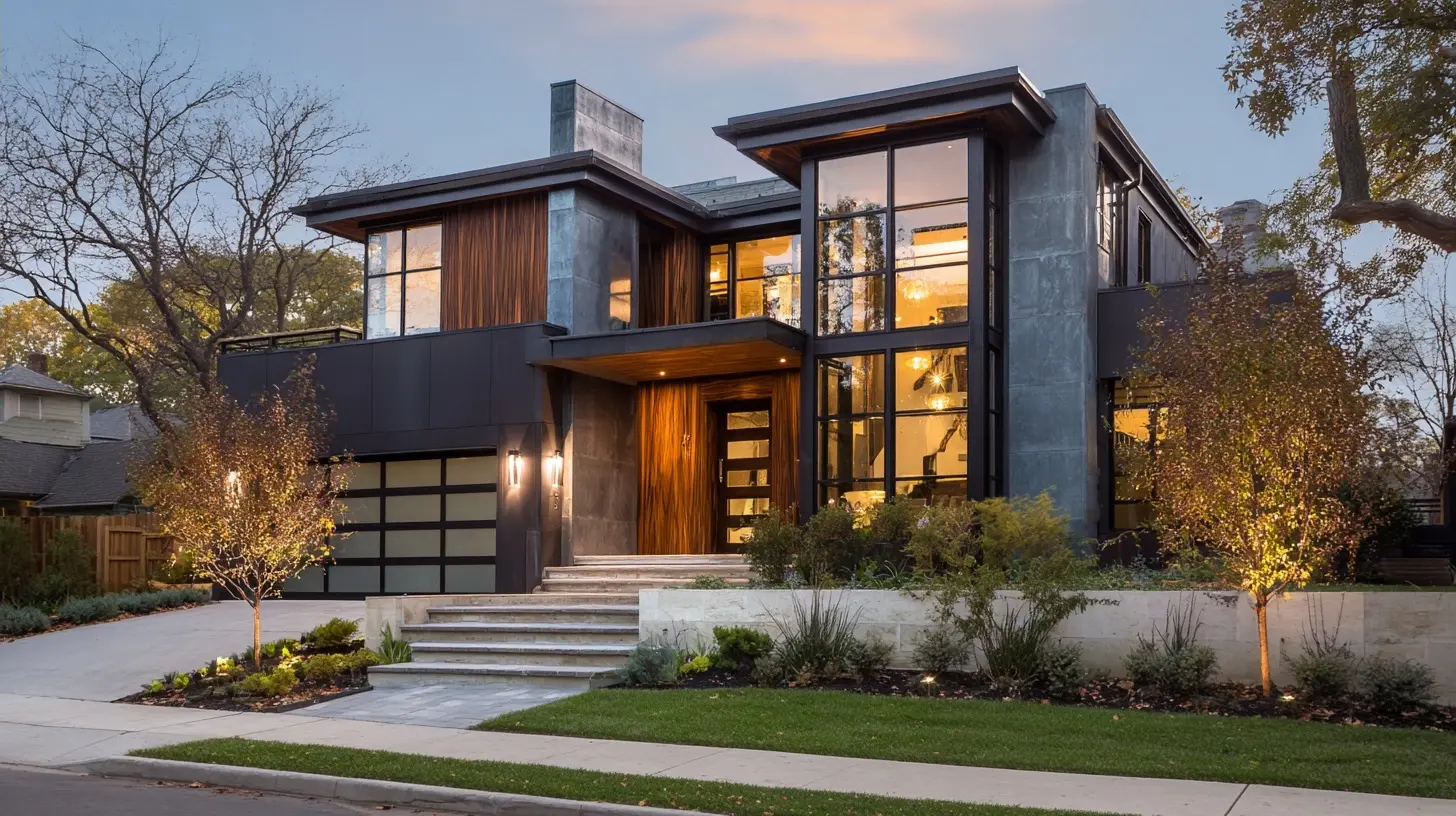
Modern exteriors often combine two or three materials: horizontal or vertical siding, a stone or brick accent, and a wood-tone soffit or panel. Material mixing works because it creates depth and breaks up large surfaces. It fails when the mix is random or when too many materials compete.A few principles help. First, limit yourself to two or three materials and repeat each one at least twice, so the facade feels intentional. Second, let materials change at logical lines, such as floor transitions or the edges of a projecting volume, rather than in the middle of a wall. Third, consider texture contrast: smooth panels next to rough stone, or vertical boards next to horizontal lap siding.
Vertical siding has surged in popularity for good reason. It draws the eye upward, which makes low houses feel taller, and it pairs well with modern roof lines. The trade-off is that vertical joints and battens need careful installation to shed water, and cheaper vertical products can look busy. Horizontal siding remains a reliable choice and tends to be more forgiving.
Board-and-batten and shou sugi ban inspired charred wood finishes are striking, but they demand commitment. Charred or dark wood finishes weather and fade, and some require periodic oiling. If you love the look but not the maintenance, composite panels that mimic the effect can deliver most of the visual impact with less upkeep.
Windows: The Quiet Workhorse of Modern Facades
Windows do more for a modern look than most people realize. Larger windows, thinner frames, and dark or matched frames all push a facade toward contemporary. The reason is simple: bigger glass reduces the ratio of frame to view, which makes a house feel more open and current.Black window frames have become almost a default, and they usually work. But be careful with all-black on a dark house, where the frames can disappear and the house reads as a flat mass. On dark facades, lighter frames or a wood tone can create the definition you want. On light facades, dark frames provide crisp contrast.
There is a practical trade-off with large windows: solar gain. In hot climates, big west-facing glass can cook a room unless you specify low-emissivity coatings, exterior shading, or deep overhangs. Modern design actually handles this elegantly through overhangs and pergolas, which are functional and beautiful. Talk to your window supplier about glazing options before you fall in love with a wall of glass.
Lighting: Designing for the Evening
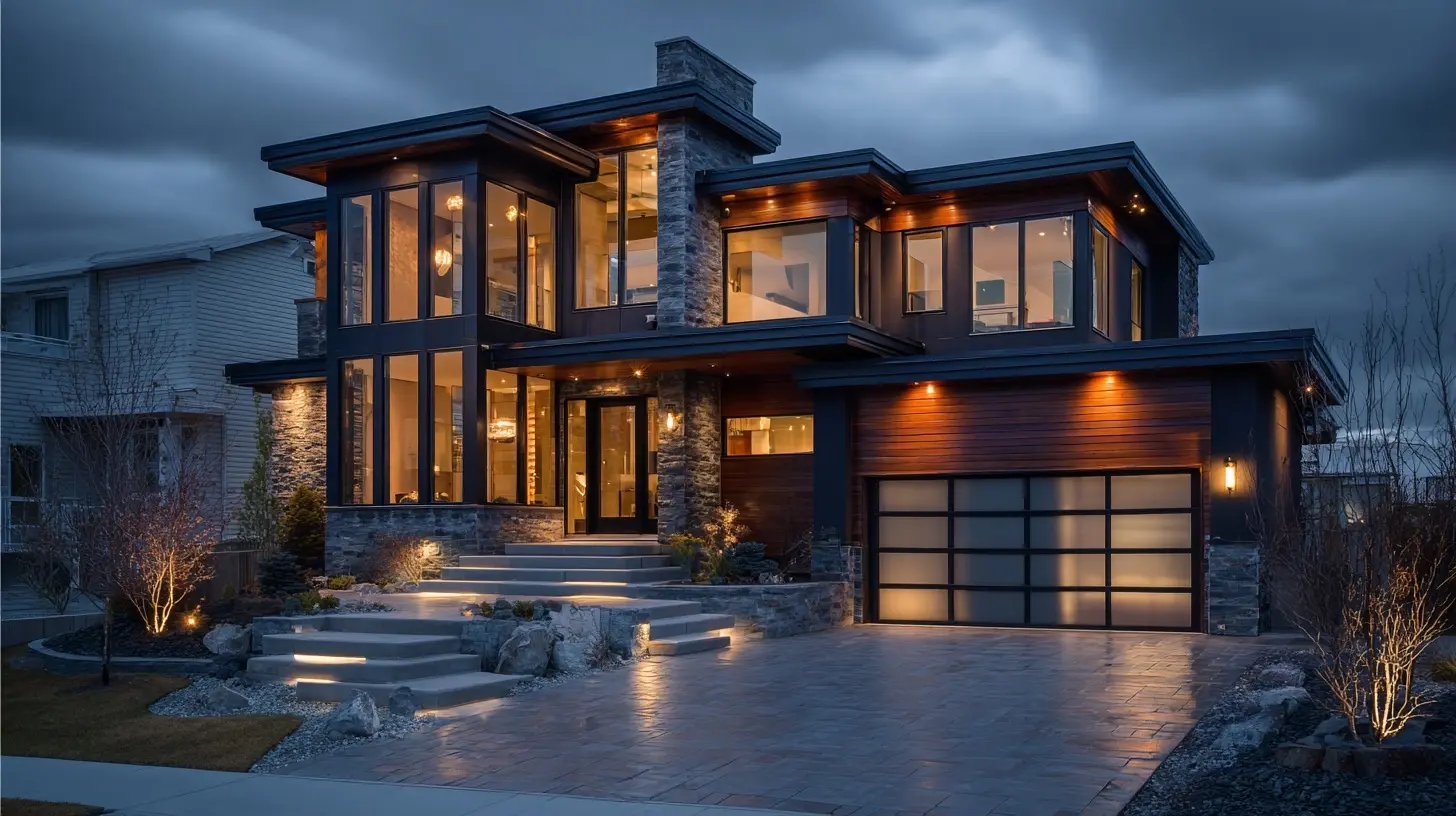
Most curb appeal advice focuses on daylight, which is a mistake. People come home after dark. Guests arrive for dinner. A house that looks great at noon and disappears at night has left value on the table.Modern exterior lighting is layered. Start with path lighting to guide feet safely, then add accent lighting to graze walls or uplight trees, and finish with a warm entry light. The single most effective upgrade is often replacing a harsh porch bulb with a warm, dimmable fixture on a timer or smart switch. Color temperature matters: warm white in the 2700K to 3000K range flatters siding and landscaping, while cooler whites look institutional.
A common mistake is over-lighting. Too many fixtures create a runway effect and wash out shadows, which are what give a facade depth at night. Aim for fewer, better-placed lights. Another mistake is glare: fixtures that shine outward into eyes rather than downward onto the ground. Shielded path lights solve this.
Landscaping That Complements Rather Than Competes
Modern landscaping is architectural. It uses repetition, clean bed lines, and a restrained plant palette. The reason this works is that it echoes the geometry of the house instead of fighting it. Rounded, overgrown foundation shrubs in front of a crisp modern facade create visual noise. Clipped hedges, ornamental grasses, and multi-stem trees create calm.Structure comes first. A small tree placed to frame the entry, a row of matching planters, or a low hedge that defines the property line all do more than a dozen random shrubs. Layering matters too: tall plants at the back, mid-size in the middle, low groundcover at the front. This creates depth from the street.
Plant selection should follow your climate and light conditions, not a photo from a design magazine. A plant that thrives in coastal fog may struggle in a dry, hot region. Native and climate-adapted plants usually need less water and look healthier, which matters more than exotic appeal. Before buying, check mature size. The most common landscaping mistake is planting something that will eventually swallow the windows.
Hardscaping, Paths, and the Approach
The walk from the street to the door is a sequence, and modern design treats it as one. A straight path reads formal and direct. A gently curved path reads relaxed. Either can work, but the materials should feel deliberate and consistent with the house.Concrete, large-format pavers, and gravel are the modern staples. Each has trade-offs. Concrete is affordable and clean but can crack and looks plain unless you add a joint pattern or an exposed aggregate finish. Pavers offer texture and repairability but cost more and can shift if the base is poorly prepared. Gravel is inexpensive and sounds pleasant underfoot, but it migrates, needs edging, and is hard to shovel in snow country.
Path width matters more than people expect. A path narrower than about four feet feels cramped when two people walk side by side. Wider paths, especially at the entry landing, feel generous and modern.
Driveways are the largest hardscape most homeowners own and the one they think about least. Widening or replacing a driveway is expensive, but resurfacing, adding a border, or introducing a paver apron at the street can modernize the look for far less. A paver apron also signals the entry and slows traffic, which is a subtle safety benefit.
Porches, Pergolas, and Shade Structures
Modern shade structures solve two problems at once: they add architectural interest and they make outdoor space usable. A simple pergola over a patio or entry creates shadow patterns that change through the day, which is one of the most flattering effects a house can have.The trade-off is maintenance and cost. Wood pergolas need sealing or painting, while aluminum and steel versions last longer but can look thin if undersized. Slatted shade structures, sometimes called brise-soleil, are popular because they filter light without blocking the view. They work best where summer sun is intense and you want shade without a solid roof.
Porches are trickier. A deep front porch is a regional and architectural feature, and adding one to a house that never had one can look grafted on. If your house already has a porch, modernizing it usually means simplifying railings, updating posts to clean square profiles, and improving lighting. If it does not, a smaller covered entry or a pergola may deliver the same welcome with less risk.
Garage Doors and the Forgotten Facade
On many houses, the garage door is the largest visible surface, and it is often the most dated element. Modern garage doors tend to be flush or lightly paneled, with clean horizontal lines and glazing options. Replacing an old door is one of the highest-return exterior upgrades because it changes the dominant shape on the facade.Glass and aluminum doors look striking and let light into the garage, but they show clutter inside and cost more. They also need cleaning. Flush steel doors with a wood-look finish offer a middle path. Whatever you choose, match the door's color to the trim or the siding rather than introducing a third color, and make sure the door's panel lines align with the house's horizontal elements.
Roof and Gutters: Details That Read as Intent
Roof lines shape how modern a house feels. Low-slope roofs and clean gable ends look contemporary, while complex rooflines with many small hips and dormers read traditional. You are unlikely to change your roof geometry, but you can change how it reads. Darker roofs recede and let the walls dominate. Lighter roofs feel airy but can look busy against a light facade.Gutters are the detail almost everyone ignores and almost everyone notices when they are wrong. Modern gutters are often half-round in a metal finish, or seamless rectangular profiles matched to the trim. Hidden hangers and clean downspout placement make a real difference. The practical point: undersized gutters overflow, and misplaced downspouts dump water against the foundation. Aesthetics and drainage should be solved together.
Budget, Sequencing, and Common Mistakes
Exterior projects tempt people into doing everything at once. A better approach is to sequence by impact per dollar. Paint and door color come first because they are cheap and transformative. Lighting and landscaping come next. Siding, windows, and hardscaping are larger commitments that deserve planning and, often, professional help.Common mistakes show up again and again. Mixing too many materials. Choosing plants that outgrow their space. Over-lighting. Painting trim a stark contrasting color that chops the facade into pieces. Installing a bold front door but leaving a dated storm door in front of it, which hides the very thing you paid for. Buying trendy fixtures that will look dated in five years. Skipping the drainage and grading work that protects everything else.
One more mistake deserves its own note: ignoring the neighbors. Curb appeal is contextual. A radical modern renovation on a street of traditional cottages can look wonderful or jarring depending on execution. You are not obligated to match your neighbors, but understanding the street's rhythm helps you decide how far to push.
Final Thoughts
Modern exterior design is less about a style label and more about intention. Clean lines, honest materials, warm lighting, and landscaping that respects the architecture all work because they reduce visual noise and direct attention to what matters: the entry, the proportions, the welcome. You do not need to remodel everything. Pick the two or three moves that suit your house, execute them well, and let the rest follow. A house that looks cared for and coherent will always read as more valuable than one chasing the latest trend.
all images in this post were generated using AI tools
Category:
Home DesignAuthor:

Basil Horne